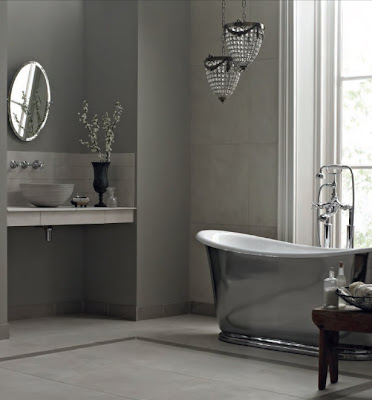
I'm working with a client at the moment who has particularly good taste, knows what she wants and trusts me to help her get there. It's the kind of project that every designer dreams of working on because it is challenging in the best possible way: I feel encouraged to push ideas much further than I normally would do and that is an exciting ride.
I joined the project a few steps in, and so, naturally, I'm working with a few preconceived ideas - developing palettes around a couple of products that I've not used before. Once of which is Fired Earth. They produce some lovely tiles and their colour palettes are inspired (Kevin McCloud's work, no doubt).
I thought I'd share with you a couple of things I've spotted on the side. What do you think of the printed tiles? I think they're charming, but I think it's the layout that really makes it, wouldn't you agree?


I love these tiles Heather, I think they are gorgeous and the layout is beautiful. I'd like to imagine they don't continue further than the pictured area though? And I love the brick tiles too! Will you help us when we buy and style our house way over here in NZ?
ReplyDeleteIs this Emma Whitlock?! Are you going to buy that beautiful property just North of Wellington? (I saw something on Facebook about it.) If so, I would be honoured! Wow, that is a fantastic project - the things you could do with that place... Please do send me more photos if/when you get it!
ReplyDeletelove those colours in the 4th and 5th shots, gorgeous!
ReplyDeleteI love the tiles in the 5th pic. I always drool over Fired Earth's stuff. We are redoing our bathroom and I was thinking about doing some accent tiles from Fired Earth, as I can't afford to do the whole bathroom in their tiles. Thanks for the beautiful inspiration.
ReplyDelete