INSTAGRAM: heatherdesigner

Monday, 21 March 2011

London Design Week - Pt 1: Fabric Collections

Silks by Zimmer & Rohde, Linens by Kravet

Visiting Chelsea Harbour Design Centre during London Design Week is always a rewarding experience. I popped down, twice, last week to meet with other interior designers (often, it's the only time we have to chat about work) and of course to see the latest fabric collections. I also attended two design lectures. There is so much to share with you that I've decided to split these events into three separate blog posts.


I love this vermilion, especially coupled with graphite/midnight blue - it has such intent.

                                       
Calvin Klein

If you really must have it (and who would blame you...), you'll find this at Kravet


This silk velvet has the must lustrous quality and although it's not new - I've been holding on to these samples for a little while, I wanted to show it to you. Silk velvet is not user friendly for 99% of the population because even a drop of water will stain it but we can still dream, can't we?


Edith - Violet

Argh, I LOVE THIS. I'm dying to use this on a current project, either on upholstery or for drapes in the master bedroom. The colours are perfect but the price tag is going to be a tough sell... Donghia also produce the most beautiful furniture - their take on the corner sofa has to be seen to be believed:
  
It was *painful* to be forbidden to photograph anything, so we'll just have to try to imagine that piece above in this colourway (below) - large cushions in the pink silk. Isn't it just the loveliest palette? 

Sahco Samira reversible  2276-22

The Donghia showroom is currently enjoying a sedate colour palette. If you're in London, you'll just have to go to Chelsea harbour to see it for yourselves - don't miss it.

Zoffany

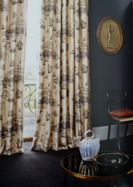
Zoffany surprised me with their latest collection. It took me a little while to love this but the colours are vibrant and, the context they've placed it in is inspiring. 

The dark navy walls (and clean lines) give the Intaglio design, sourced from their archives, a certain modern relevance and is a perfect example of the power of context. Other favourites were Lelievre for championing Vermillion; Sahco for their silks & Zimmer & Rohde their sheer variety designs.

Where you there, too? What caught your eye? 

SHARE:

Saturday, 12 February 2011

Finding the Light


I was chatting with our Project Manager this afternoon when she mentioned in passing that she had recommend a potential client look at my blog before she even thought to mentioned my website (which is lucky as it's not ready, yet...). 

A couple of things she mentioned liking about this blog are that 'it's generously spirited' and that I don't ever try to sell my work to my readers. Of course, it's always great when people get what you're about but it made me think about why I don't share my work with you, more? You know, chat about what I do and how I do it?


And so, earlier this evening I popped in to see a client who's project I had completed a while back (he has asked me to do other sections of the house, this time). It was such a pleasure to see the place in much the same state that I left it. I took this photograph of the bathroom storage area that I conceptualised (furniture designer & maker Claire Darwent designed and built it out of solid Iroko - this wood was once science school desks) and I wanted to show it to you because I think it's a very clever use of space. 

There is not a straight wall in this house and so Claire had a job on her hands getting it to work but doesn't it look great? I love the warm wood against the cool charcoal (metallic) wall tiles. 


What I love most about this project is how well it flows - you may have heard of this term. Flow relates to how light (and colour) moves through the home and it has everything to do with good spatial layout. Achieving a good flow is one of the most important things to get right when designing an interior.


A little known fact: for a year, whilst completing my studies at Saint Martins, I worked as a florist - much like interior design, it's not nearly as glamorous as it may sound but knowing how to arrange flowers is such a useful skill. In fact, I've found that there are a number of 'transferable skills' between being a chef, a florist and an interior designer. Working with colour is an obvious one but really, time management is king.


I selected and commissioned most of the art in this house. The architectural paintings are the work of Beth Louise Walker. Just how talented is she?! I love these paintings - she also did the life drawings, above. (Beth is a delight to work with and a wonderful friend, too.)


This handrail was originally painted white and once we stripped it down we found out why... (Luckily, it was nothing a little restorative work couldn't fix.) Now, it's a defining feature of the house. We also stripped the (yellow toned) Maple floors and applied a walnut finish.


Do you see the how the light and colour palettes, in each room, connect?  What do you think? Does it work for you? And whilst we're here, what hidden skills do you have? I'm curious...
SHARE:

Thursday, 3 February 2011

Designer Paint Palettes


Whenever I open a colour card, the first colour I look for is Grey. Rightly or wrongly, I decide whether a particular brand are any good by how they master these shades. (Reds are notoriously difficult to get right, too.)

The paint companies I use most often are Farrow & Ball and The Little Greene Company and, between you and me, I lust after Zoffany's range of colours. Of course, Dulux is the big brand but I refer to them less and less these days because the coverage of the designer brands is superior. It's as simple as that.

I'm going to show you the colours that I feel stand out from each of my favourite paint companies

1. Zoffany

Interiors fabric company Zoffany released their own brand of colours to support their range of wallpapers and it is a fantastic range of colours. I love it so much that I have their entire chart pasted up on my 'Great Wall of Thoughts and Inspiration'.

My one bug bear with them is you can't go into your local paint shop and pick it up - you have to pre-order it. Grrrr, you can just image what the painters make of that... (If someone at Zoffany is reading this, please sort this out. I'd buy your product if you made it more accessible. Truly.)

Vermeer Yellow Gorgeous!

Victorian Purple. I cannot wait to use this...

2. Farrow & Ball

 Farrow & Ball are the popular choice with my clients; they offer brand confidence and so, they are an easy sell. Due to the VOC ruling, F&B no longer produce oil based paints which means that painters (who know what they're doing) wont use the water based eggshell on certain surfaces. Read specialist craftsman, Andy Crichton's fantastic blog for more detailed information.

Now F&B have a number of colours that work hard for the money but the new colours for 2011 are amazing - I love them all! These are just 4 of my favourites:


Charlotte's Locks

Brassica Hardwick White Charlotte's Locks
  Brassica                Hardwick White          Charlotte's Locks


Which leads me to Hardwick White. This colour is an old favourite of mine. It has a strong green undertone but look how well it copes with these strong colours...

 Lonsdale Square 2007                                                        Elmwood Rd 2010 


3. Little Green Company
I love the palettes but the sample pots are too small!

I'm a big fan of Little Greene Company - they're all rounders: Great colours, great product, super customer service. They are also absorbing many disgruntled F&B customers looking for an oil based eggshell in a Heritage colour and they do not disappoint. I love their greys - French Grey never fails me. Great website, too - you can shop by colour 

Lately, I am loving these...


It is important to always sample paint colours, onsite, especially if you're living within an existing palette. To do so, effectively, paint individual colours onto large boards (preferably non-porous) so that you can move them around the room during the day to see how the colour is effected by the changing light.

All three companies listed have excellent websites so you can play around with these palettes before you sample. What do you think of these colours? Are any of the new colours rocking your world?
SHARE:

Monday, 24 January 2011

Upstairs Downstairs and Every Colour In Between


Did anyone else catch that series Upstairs Downstairs that was broadcast over Christmas? All I can say thank you iPlayer for kindly affording me the opportunity to go back to study particular scenes to, you know, get my hit of colour and my fill of design...

wouldn't that make an extraordinary print for textiles? Great colours
I don't use Photoshop because I prefer to work by eye and so, the colour will differ, slightly. I like the greener tone.

Aside from being an enthralling storyline, the cinematography is incredibly beautiful. These screen-shots do not do the film justice - I struggled to narrow down the selection and evidently just gave up, posting pretty much all of my favourites. If you happen to see the series on DVD, grab it: it is an Education.


The production designer who worked on this series is Eve Stewart has been nominated for an Oscar for her work on the 12 Oscar Nominated The Kings Speech. Although I am excited to have another opportunity to see her work (I haven't seen the film, yet), I am not in the least bit surprised - she is incredibly talented. Just look at her IMDB page to see the how many great films she's worked on. Amazing.

Where does this wallpaper comes from? Could it be an original?

I love this room - every surface area celebrates the next. The colour palette is so elegant. 
a quick selection of modern wallpaper, products & accessories

Vermeer painting? (I like the way the light catches her elbow)

a quietly dignified, steely grey palette. So fitting.


Thank you to Oliver who says: "I believe the set designer of this 6th Series was Eve Stewart who also worked on “The King’s Speech”." Well, that's certainly not one to miss... 

Other great films with incredible colour work and/or interior design are:

  • A Single Man 
  • The 39 Steps (with Rupert Henry Jones)
Please feel free to add your favourites in the comments box - I'll pop them up here.

SHARE:
© Heather Jenkinson | Interior Design . All rights reserved.
Blogger templates by pipdig